Legacy Product
The Dataflow Legacy product , allows to create dynamic pages connected to the Cegedim data models. It is a highly customisable product, currently used in more than 5 countries and 500+ professionals
API Console
Requests from multiple Partners for a more flexible framework and interface rendering, separate business logic from the frontend to enable usage of modern frameworks like React and Angular.
connected to the Cegedim data models. It is a highly customisable product, currently used in more than 5 countries and 500+ professionals
Design process
With full support from the General manager and the Product Owner, we implemented a new product and feature design process to increase the development rate and quality as well team morale and satisfaction.
To improve quality, product usability, feature discoverability, a Functional Analyst and Scrum Master were brought on board to assist the Product Owner.
This also opened up the door to start using React for developing front-end internally, a great change at organization level.
Design Guidelines
All applications were lacking consistency even between different screens or sections of the apps, so a clear set of Guidelines were implemented at team level to solve main issues raised by customers, partners & the team members:
- Maintain design consistency between different products and give a sense of unity
- Improve front-end development process
- Increase the minimum accepted quality and help the Q&A team perform automatic tests
- Maintain a clear language between the designers
Color Scheme
Modernised and improved the contrast and other accessibility issues that were with the original color palette.
#291d7b
#0288d1
#a1d51c
#ef5b09
#05012e
Component Library
The team decided to start exploring new development frameworks in order more issues that getting in the way of good products, and working closely together with the front-end dev team we decided what would the components be and what will be their states, allowing modularity and more complex components to be created by partners.
The visual library is inspired by the legacy Dataflow product to provide ‘backwards’ compatibility for the partners who have not upgraded yet and help enforce the brand.
UX Design
After discussions with various partners from within the Software factory but also from other partners within the Cegedim Group, We designed an easy 3 step process for creating the API endpoints.
The usability was designed with professional programmers and experts in mind so usability concerns had different rules in order to allow quick access to what is needed at that particular step in setting up the API.
API Services
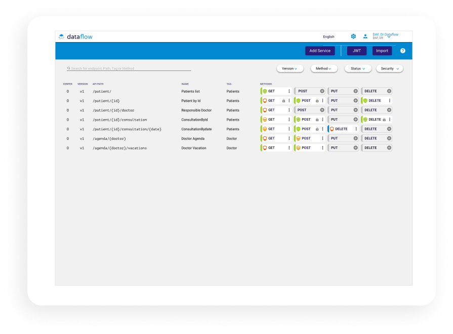
The main dashboard screen lets you see all the endpoints, paths , and configuration types at once with just a quick glance. Contextual menus make actions available exactly where its needed.
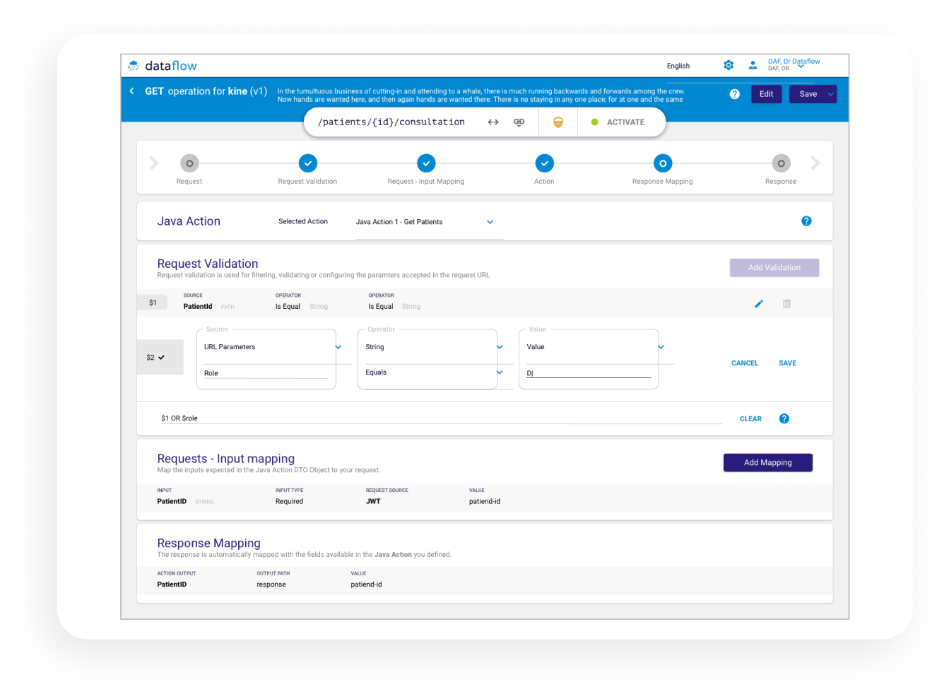
Endpoint Configuration Screen
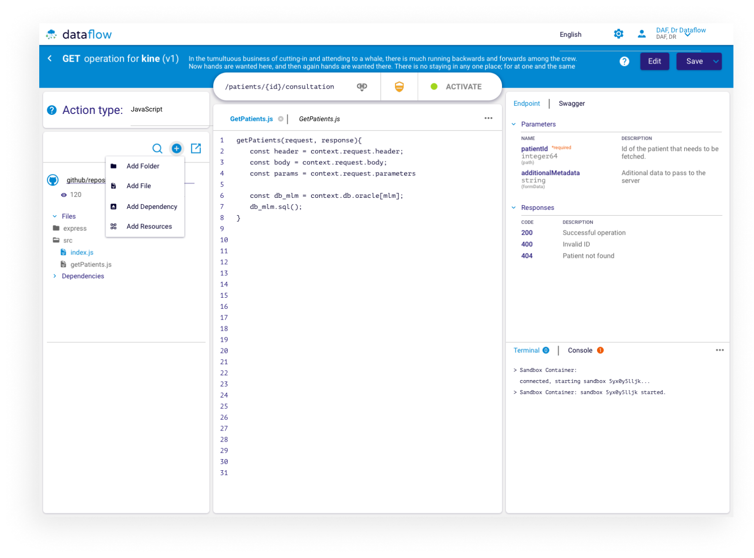
This is the place where all the relevant points are set up: Business Logic, Input validation, Output mapping, Endpoint Security and settings as well as some management features available.
This screen is the outcome of 4 iterations and many meetings with the partners & developers to fit their specific needs. The test was done on site where we’ve performed multi variate testing and expert interviews.
Javascript Editor
One of the unique selling points for both the customer and the business is to allow easy api business logic & configuration through an javascript console and editor.
This idea was further explored that it could lead to an internal marketplace type of platform to be used for sharing configuration files between the different partner in the Cegedim Group.
Modals & Other UI
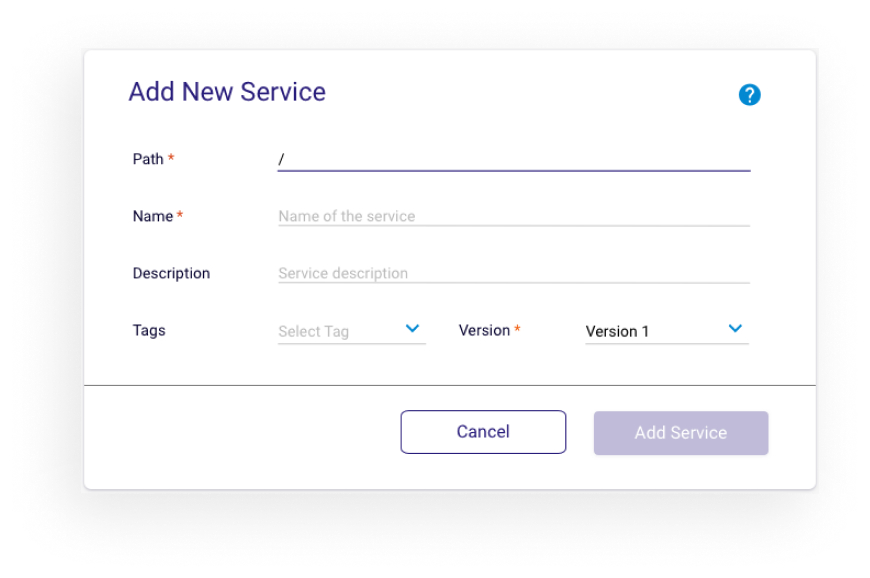
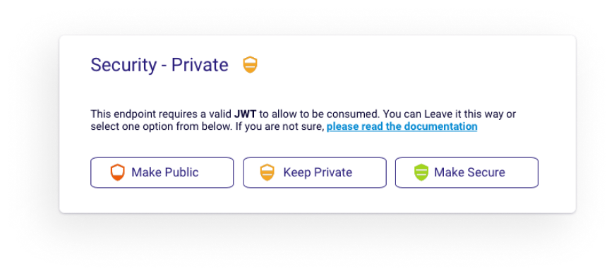
Many of the configurable options in the app are done as modals, in order to keep elements reusable ( front-end devs love this ) but still providing a level of customisation, to help the users navigate faster ( identify options by color), allow use of customisable defaults for repetitive tasks etc.
Interaction Design
In order to simplify and improve some of the painpoints reported by users or extra functionality that was needed by our test users, we decided to delegate some of these solutions to Interaction Design.
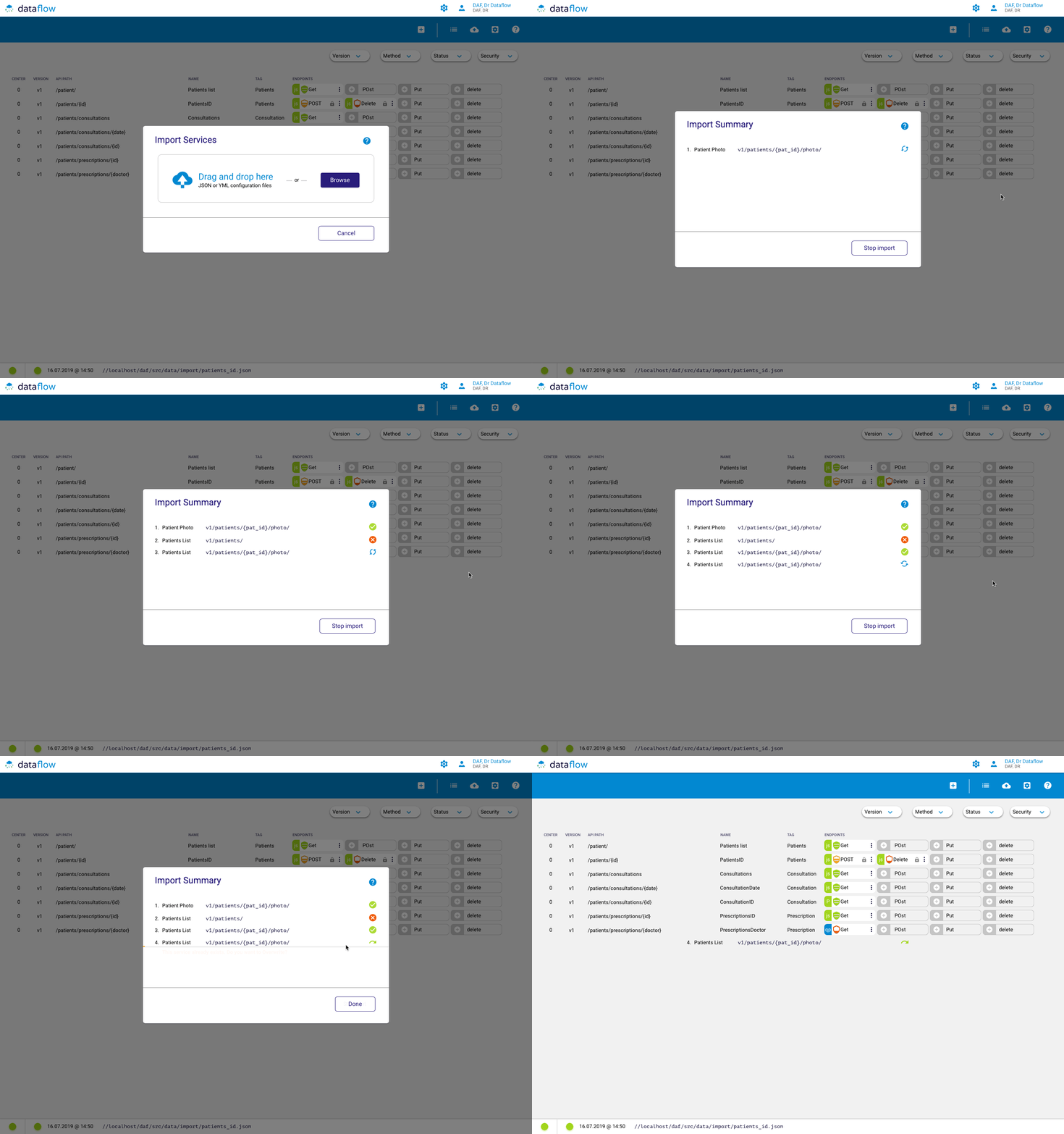
The solutions designed and presented here are the result of several design iterations, and where aimed to give a visual example to the frontend developers and to showcase the new modern functionality and interactions to the stakeholders.
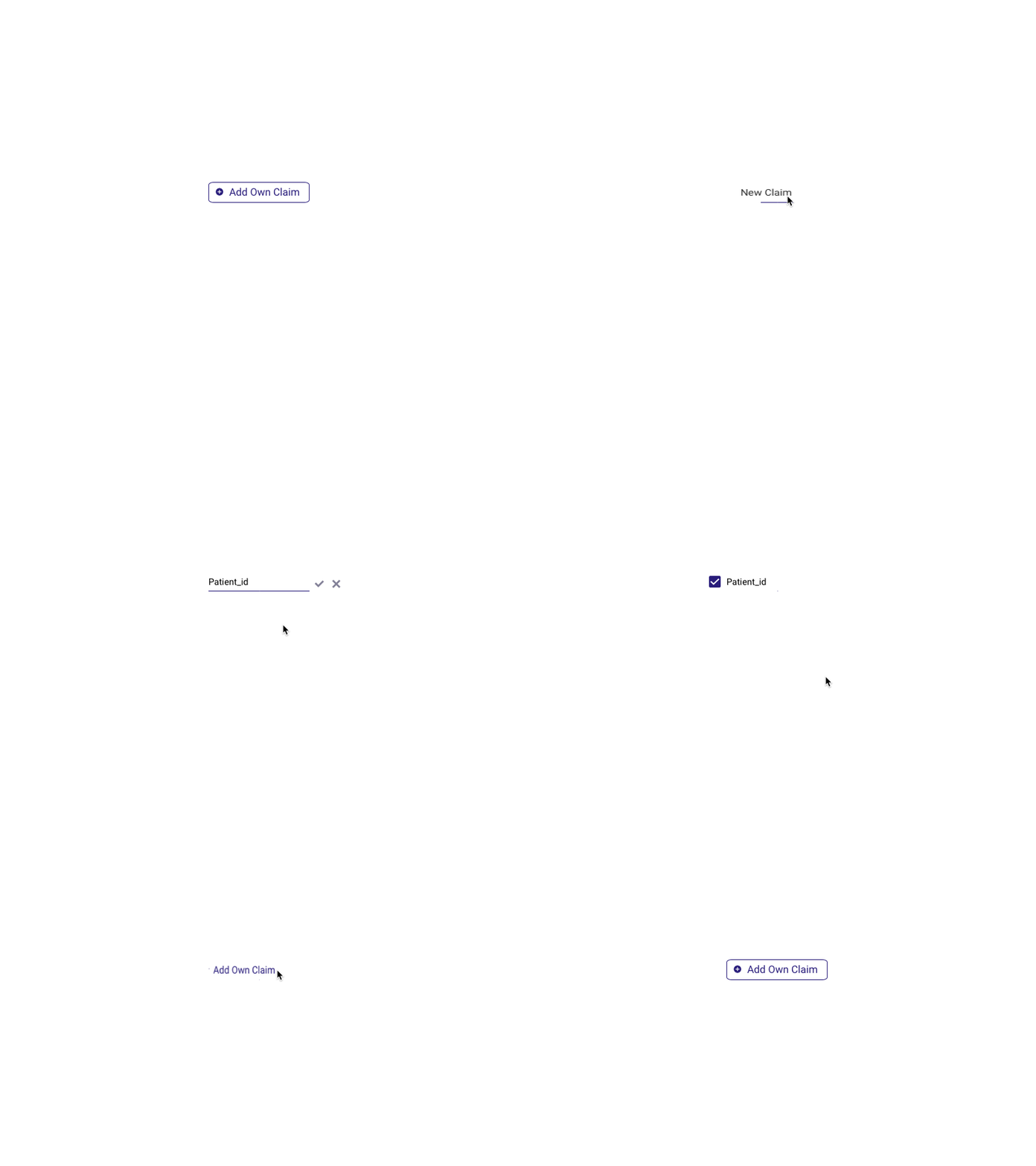
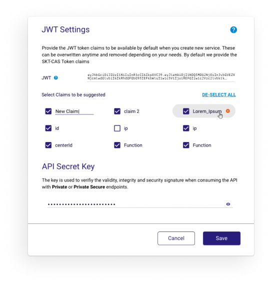
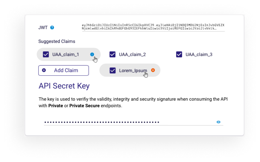
Adding custom claims for the security modal is a set of HTML elements, each one triggering the next , moving from a Button > Text Field > Checkbox and “Material UI Chip” component on hover.
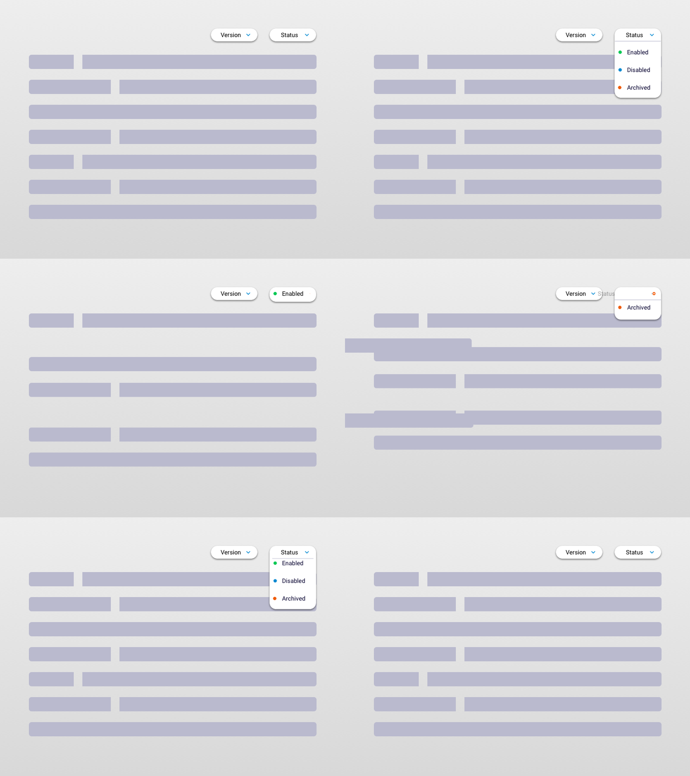
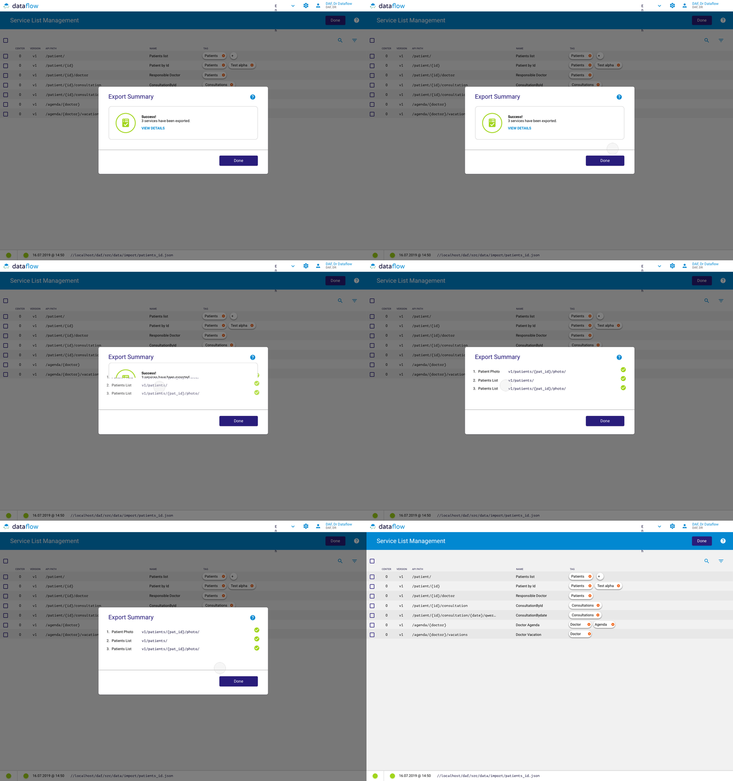
The animation for filtering for different type of API services was used to explain to the development team the difference in perception of items magically disappearing or “being removed from the list” and how this is creating a better experience.
UX in the Office
In order to get good user experiences within the digital products or services we are creating sometime we have to get out of the digital world and solve problems for the team.
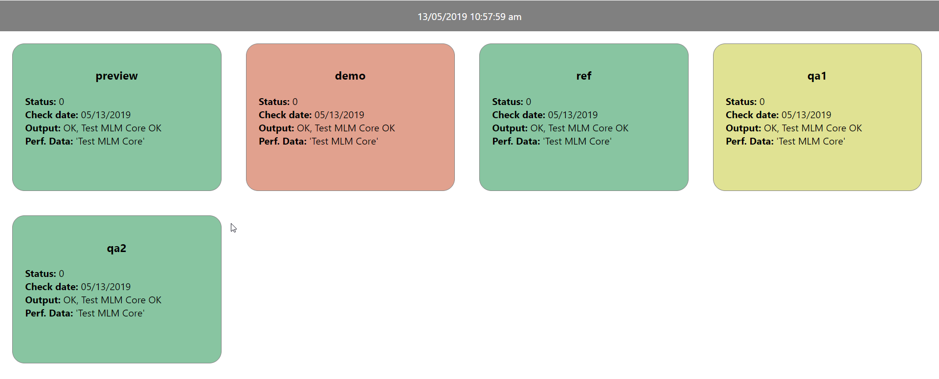
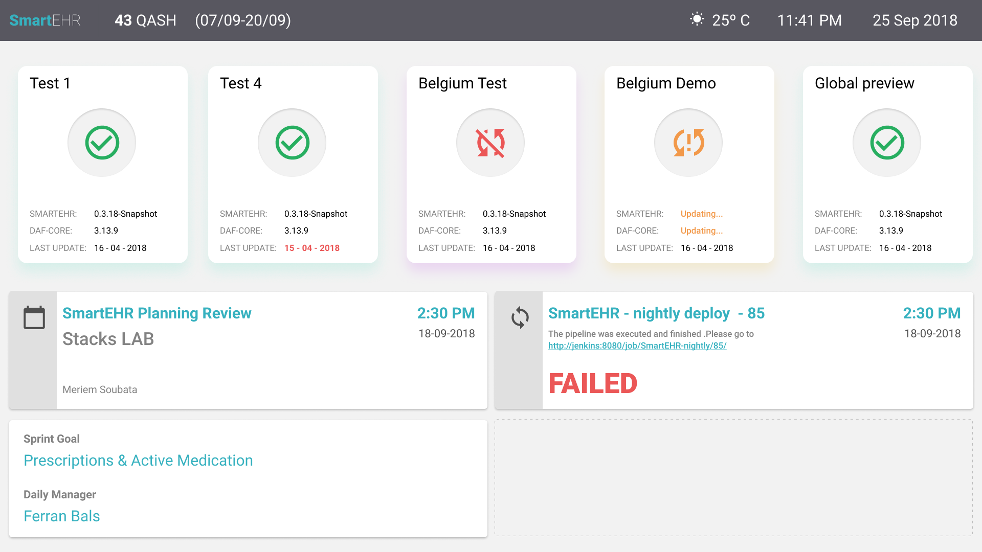
One of these problems that the team was facing, because of various reasons, was that the state of the 4-5 dev, qa, customer and preview environments was not known. The applications being composed of many other apps, each one updated according to it’s own roadmap it was easy to loose track.
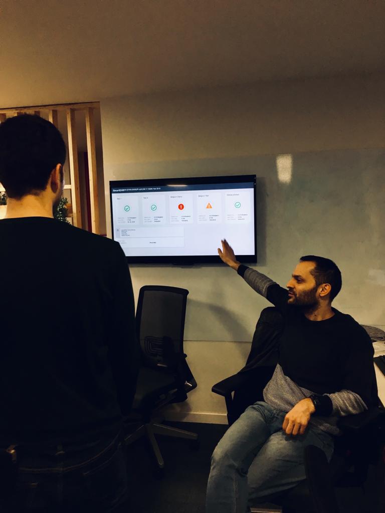
I performed some basic user tests on my dev team members and found out that the solution was in front of us. It was the unused TVs near each teams members.
I’ve set out with Xavi ( one of the FE/BE devs) to create a prototype and figure out all the data we wanted to connect:
After finding a way to get the environment data, like the Status, and if several important components are running, we focused on connecting more pragmatic functionality like:
- Current Sprint Name and Dates
- Outside Temperature, time and Date
- Connecting with the team calendar for next meetings
- Connecting the nightly deploy messages ( so we don’t get spammed)
- Sprint goal & daily manager roles
These dashboards were adopted by teams in the office, and since it was created with React and had all components correctly designed, it allowed each team to create their own widgets that would fit their specific needs.
The Team
This project is a combined effort of many people, countless iterations and a lot of technical hurdles to pass.

Stephane
Product Owner

Montse
Backend Dev

Vicent
Software Architect

Pedro
Functional Analyst

Dani
Backend Dev

David
Q&A

Valentin
UI UX

Paulo
Backend Dev

Xavi
Q&A

Xavi
Front End Dev


