Repetier Host
CLIENT NAME
Repetier Software
PROJECT DETAILS
Design Revamp
MY ROLE
UI UX Consultant
Who is Repetier?
Started in 2011 by 2 brothers deeply interested in 3D Printing technology, because there was no useful software available for 3D printing. The first product was Repetier Firmwware to be installed in the printer, and the Repetier-Host, used to control the printer from the computer.
The software is being currently shipped with many 3d Printers sold now on the market, and has also found it’s way in CNC and other computer controlled machines, as it’s one of the best free products of this type on this market.
Existing Design
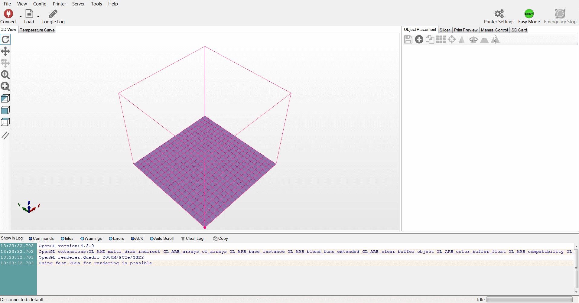
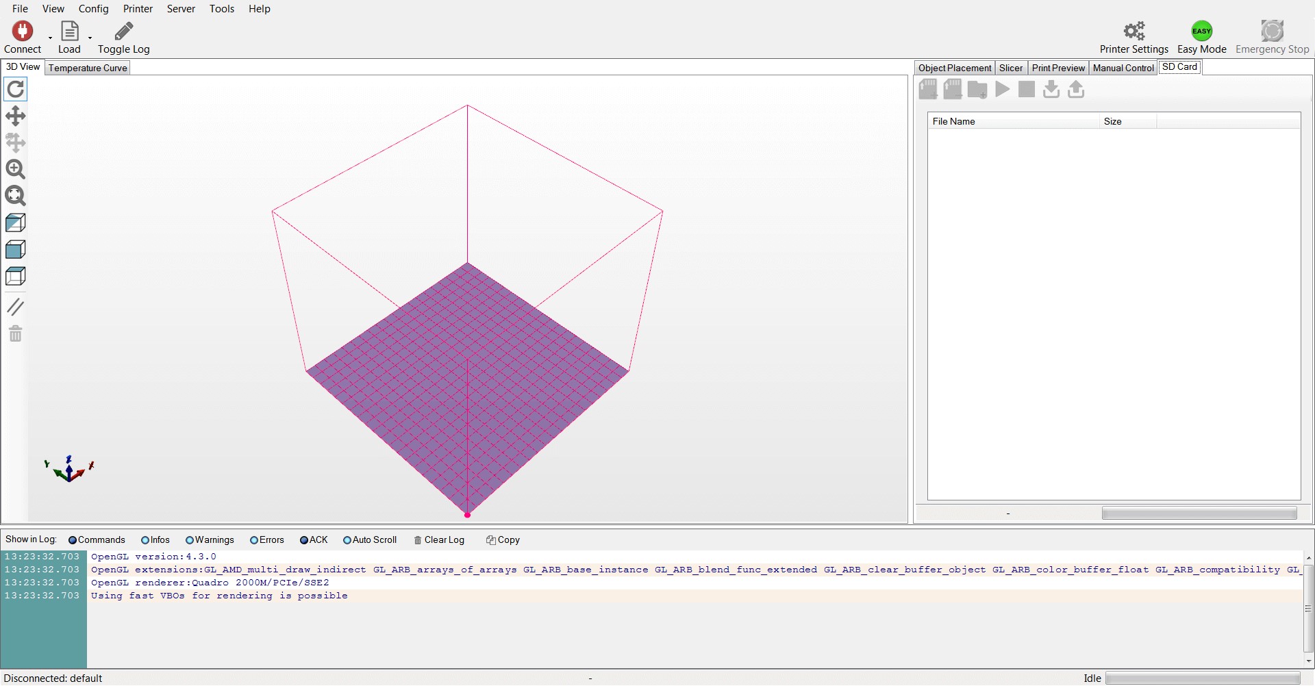
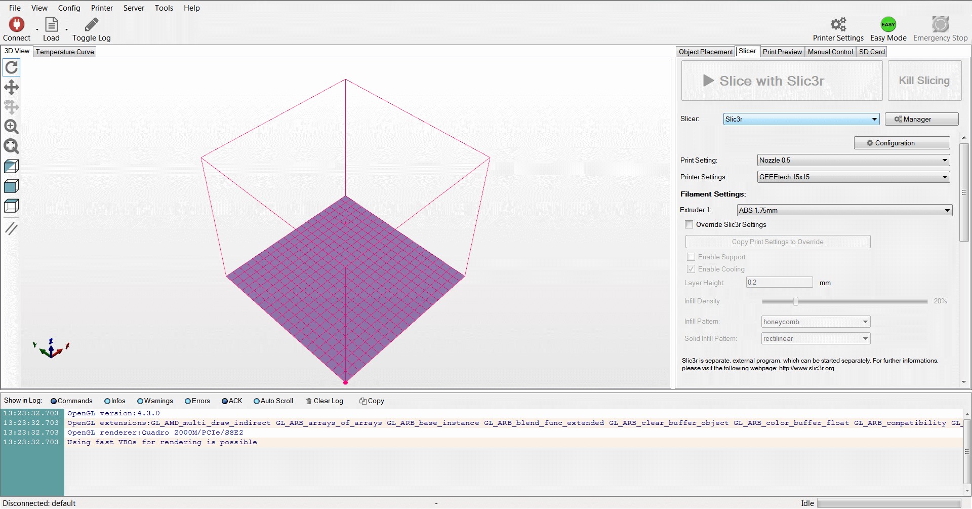
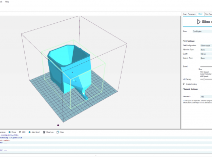
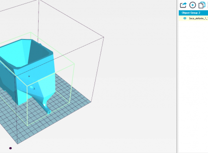
The apps initial design was very utilitarian/functional oriented and there was no major focus on usability and aesthetics.
The default design aspect made the app have a very long learning curve, requiring the user to understand different subtleties between menus and options having the same name and slightly confusing iconography which was very basic and using a very out-dated style.
My Approach
After starting out fresh in 3D Printing and having used the software for a few months, naturally I’ve noticed several basic issues in UX heuristics and in basic usability. I have decided to address this issues and present a design proposal to the developer company in hope of improving this software.
- Duplicate content causing confusion – Having two different areas in the software for “Printer Settings” was causing a lot of confusion in which part were actually the settings you were looking for and what was the difference between them.
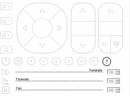
- Controls difficult to use – Using the manual control for the printer was quite difficult with the existing layout especially when live troubleshooting the printer, allowing for mistakes to happen.
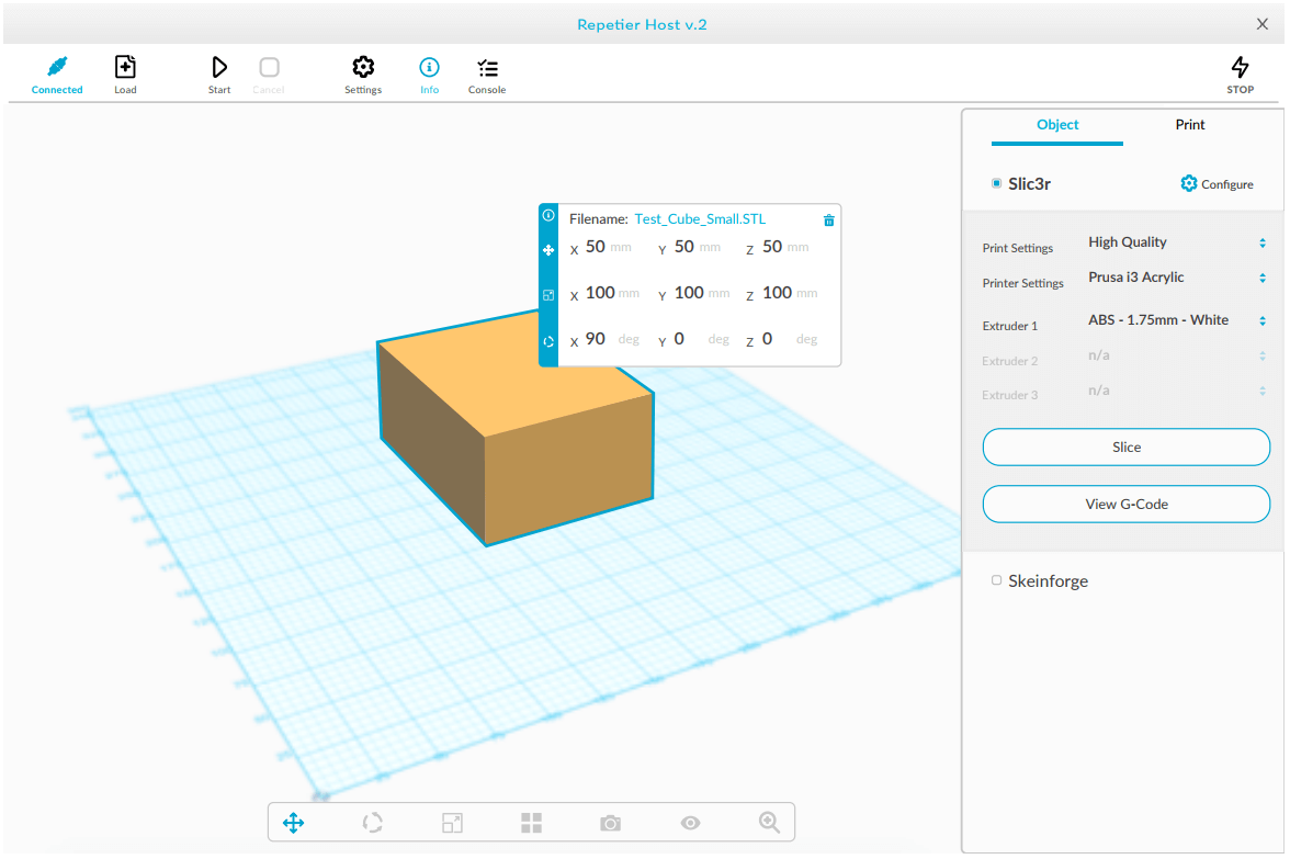
- Toolbar control redesign – Using the toolbars to manipulate the viewport and object placement changed to improved mouse control.
- Tab Issues – Configuration elements were not grouped for specific slicer being used, so there was confusion on both editing and debugging issues with the specific object printed.
UI Design
The first design concept that was presented to the company was done before i knew and understood their current technology stack and what are the development limitations. I have taken an idealistic point of view of where any top-tier software from this industry should be at.
The actual designs that were implemented varied differently from the initial concept presented. The main points of making this different and having to change the general approach was that the app is written in Visual Basic and the UI was very limited regarding style and options.
Other major blockers that interfered were software architecture: it was built using 3rd party apps which were limiting the options available from a UI / UX point of view


