THE
PROJECTIONIST
CLIENT NAME
Alien Film
PROJECT DETAILS
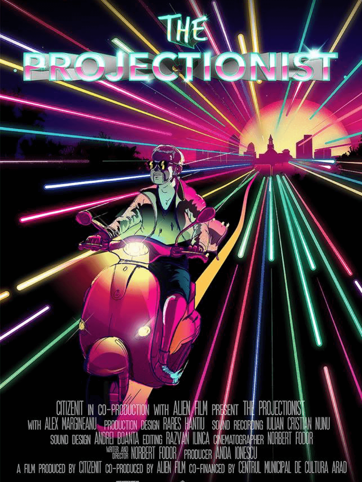
Illustration / Movie Poster
MY ROLE
Illustrator
FIN
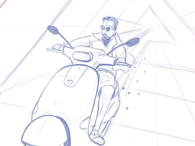
The initial sketch was done with a ball-point on paper, then transferred to Photoshop to make it easier to set-up the image composition, the proportions, exact angle and other possible elements.
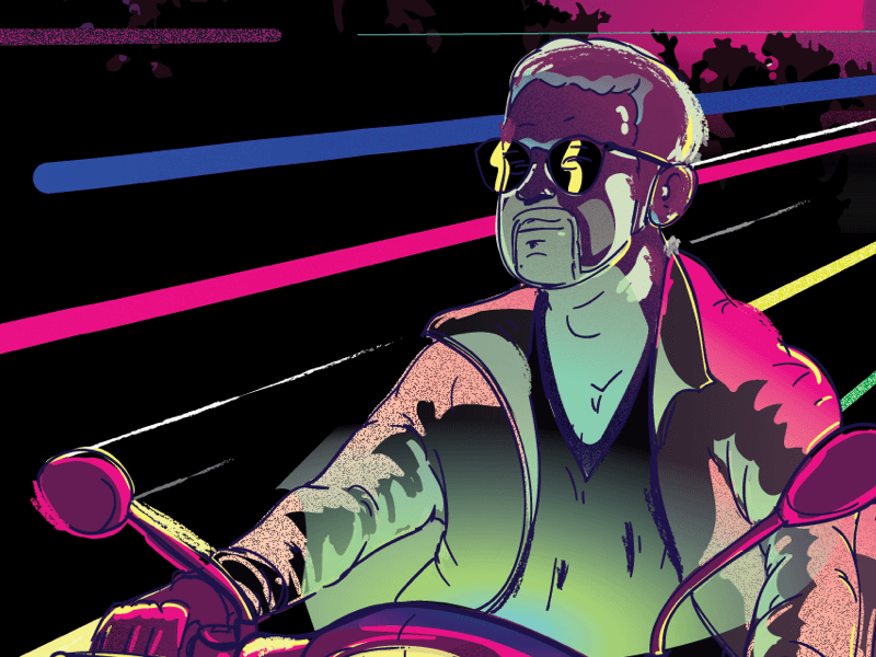
The client provided a somewhat strict color palette which matched perfectly with the style of the illustration, and after most of the coloring and basic shading has been done it was transferred to Illustrator to create is a vector.
The final touches were provided by the client such as the movie title and the credits, including the font, style and placement.
The movie got featured at TIFF16.
BONUS
THE MAKING OF
Done using a Wacom Intuos 5 in about 1 week of constant back and forth communication with the movie director, making sure all the specific details were according to his vision.


