Smarty Spell
CLIENT NAME
Smarty Ears Apps
PROJECT DETAILS
iPad UI & UX
MY ROLE
Lead UI Designer
Color Palette
Specially chosen to appeal to the young target audience, using vibrant and contrasting, but not harsh tones, while staying within the design trend.
The Logo/Mascot
To further enhance the experience for considering the young target audience as low as kindergarten, I have decided with the CEO to develop a mascot that would engage the users, and use a stylized version of it as the Apps icon and part of other UI elements.
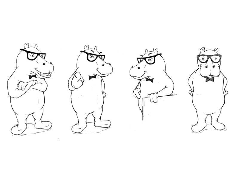
We have decided to design a Geeky and Friendly Hippo to be used as the Guide, On the App Logo and other marketing and promotional material.
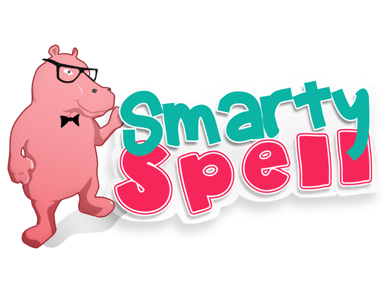
App Screenshots
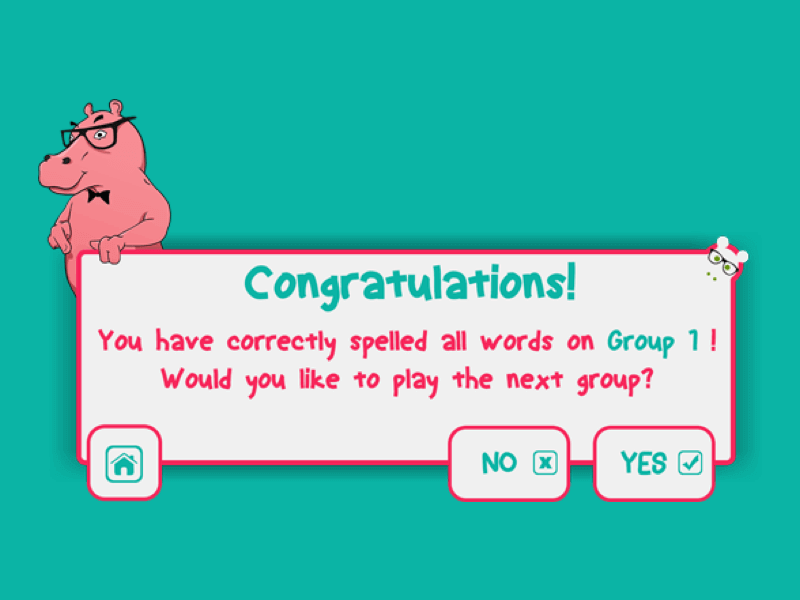
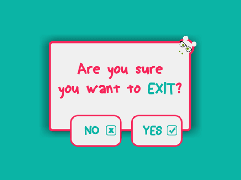
Dialog / Modals
Even though the app was designed for kids as the primary audience, the therapist/tutor/parent will also guide the young ones, thus, all the decision making steps were designed to be a match for both audiences, the Young ones to recognize them as areas where they need adult assistance, and the adult to efficiently take decisions.
Mascot Poses
To further assist the marketing and other promotional uses, as well as further UI integrations of the Mascot ( Guided Tutorial, In-App purchases, In-App marketing etc) , more poses were designed for the mascot.
Smarty Ears
If you want to find out more, I highly recommend going to their website www.SmartyEarsApps.com as together we have created more than 50 Apps on the Appstore.


